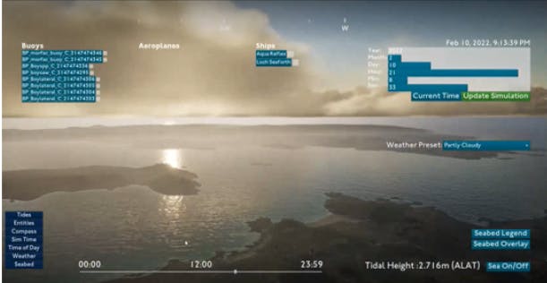
Image of the digital twin prior to user experience design
An insight into the roles and activities of a User Experience Designer when designing the controls for a VR visualisation tool
The project brief required designing intuitive controls for a 'Digital Twin' Virtual Reality (VR) tool, with usability considerations for both gaming and desktop platforms.
The initial interface design was cluttered and lacked coherence, with elements haphazardly placed by developers without a user-centred approach.
As this was an introductory project at UKHO, I had a one-month deadline, was new to using Figma and worked independently. My responsibilities included user research, workshop facilitation, and UX/UI design. I collaborated with a team of six Geospatial Intelligence Systems (GIS) developers to bring this project to fruition.
Image of the digital twin prior to user experience design
At the outset, there were no defined user personas for the tool. To address this, I began by interviewing each stakeholder to gather insights and perspectives. Following these interviews, I employed affinity mapping to synthesize the data, uncovering key themes related to challenges, constraints, competition, potential users, stakeholder expectations, and risks.
Discussions with the development team revealed the need for a unified understanding of the user base. A primary challenge for this tool was to present complex datasets in a clear and concise manner.
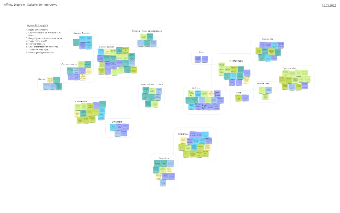
Image of stakeholder interviews affinity map
To further refine our understanding of potential users, I organised a workshop aimed at aligning the team on the primary user groups. During the workshop, I facilitated a brainstorming session where team members listed all possible users of the tool. We then organised these users into a matrix, categorising them based on their perceived value and engagement level. This exercise helped prioritise user groups and ensured that our design focus was aligned with the most impactful and engaged users.
Image of affinity map of potential users and their industries
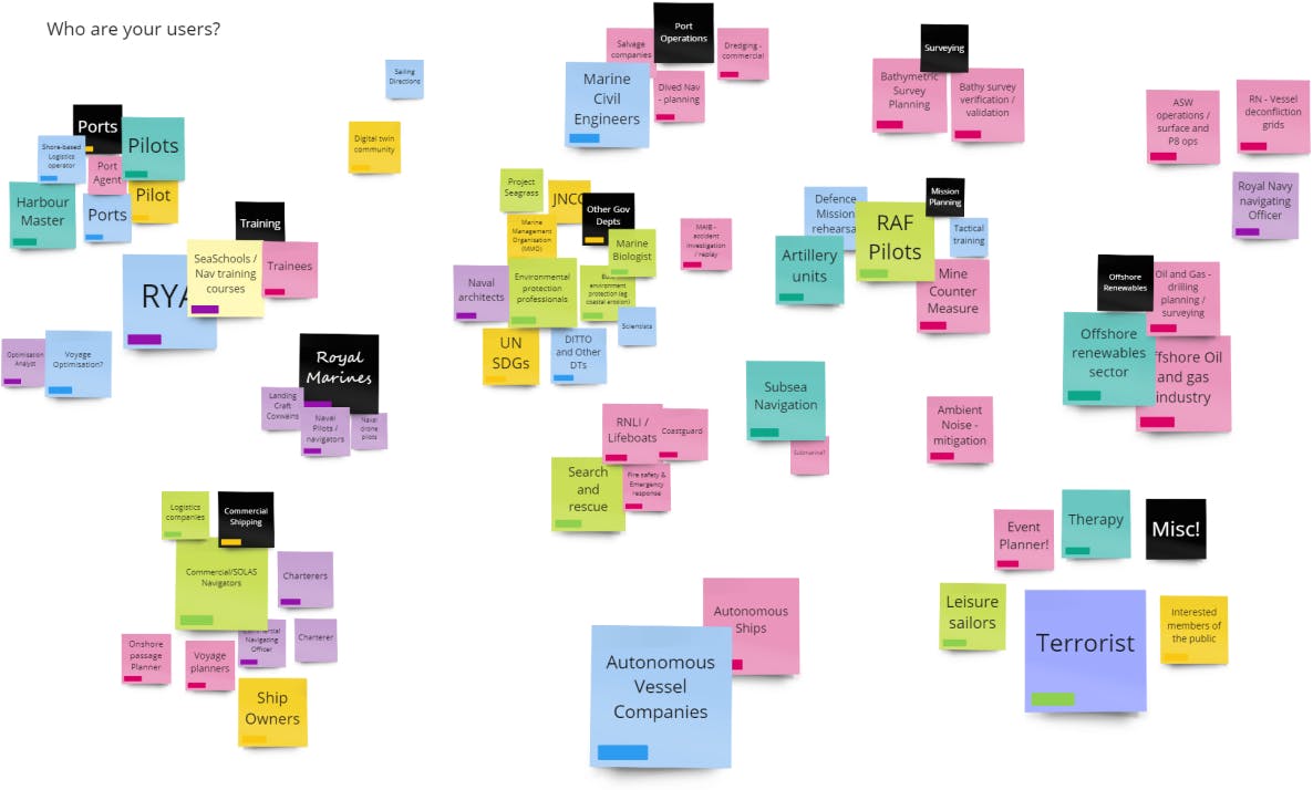
Image of users value vs engagement matrix
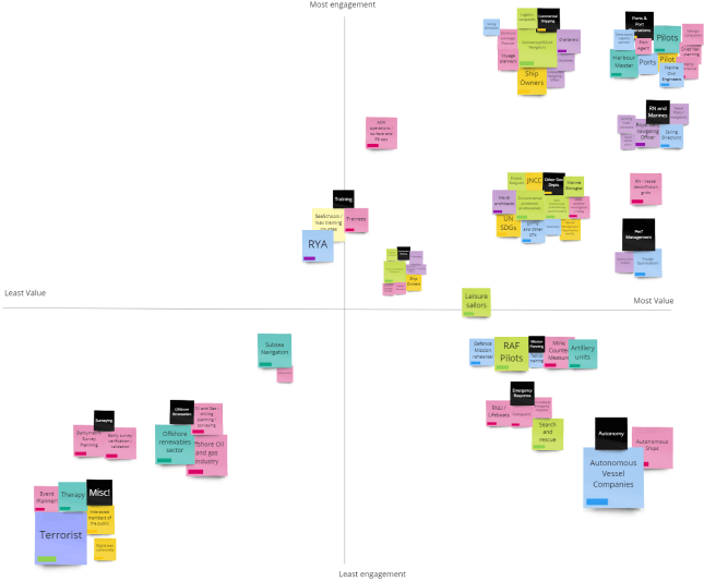
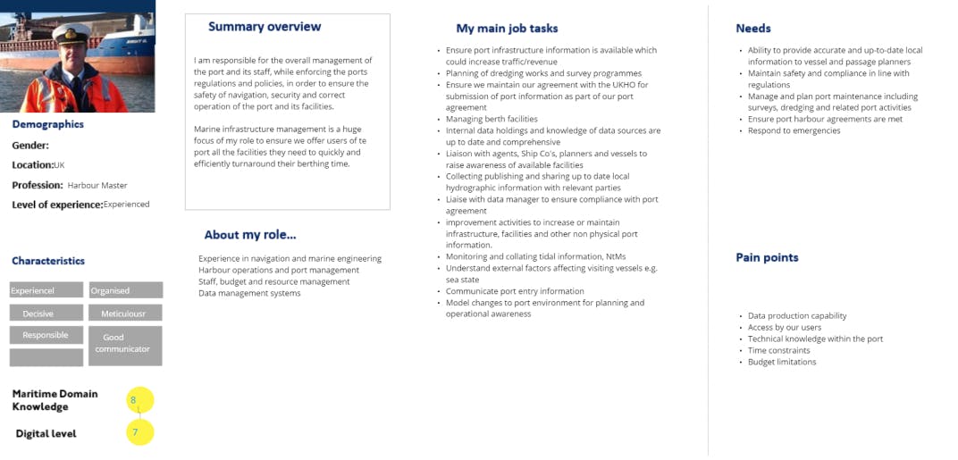
From this exercise, the team agreed that the primary user groups of highest value were ports and port operations, commercial shipping, and the Royal Navy/Royal Marines. I then tasked the team with gathering assumptions about the ‘needs and goals’ of these users, which led us to start developing assumption-based personas.
Image of an assumption based user persona
With a clearer understanding of the user base, I completed a competitive analysis examining navigational and military training simulators, as well as mainstream commercial products like Google Earth.
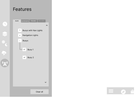
Example of desktop controls
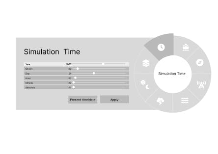
Example of gaming controls
I shared the wireframes with the team to gather feedback and made revisions based on their input. Once the designs were refined, I presented the high-fidelity versions of the preferred concept.

Default home screen inactive
Working on a VR proof of concept in its early stages was a rewarding experience that allowed me considerable creative freedom as a new designer. Although the project would have benefited from a more thorough discovery phase and an earlier understanding of the user, constraints made this challenging.
The standout achievement for me was the implementation of the sidebar navigation. This approach was well-received by the wider UX team and has since been formalised as a design pattern and incorporated into the UKHO design system.


