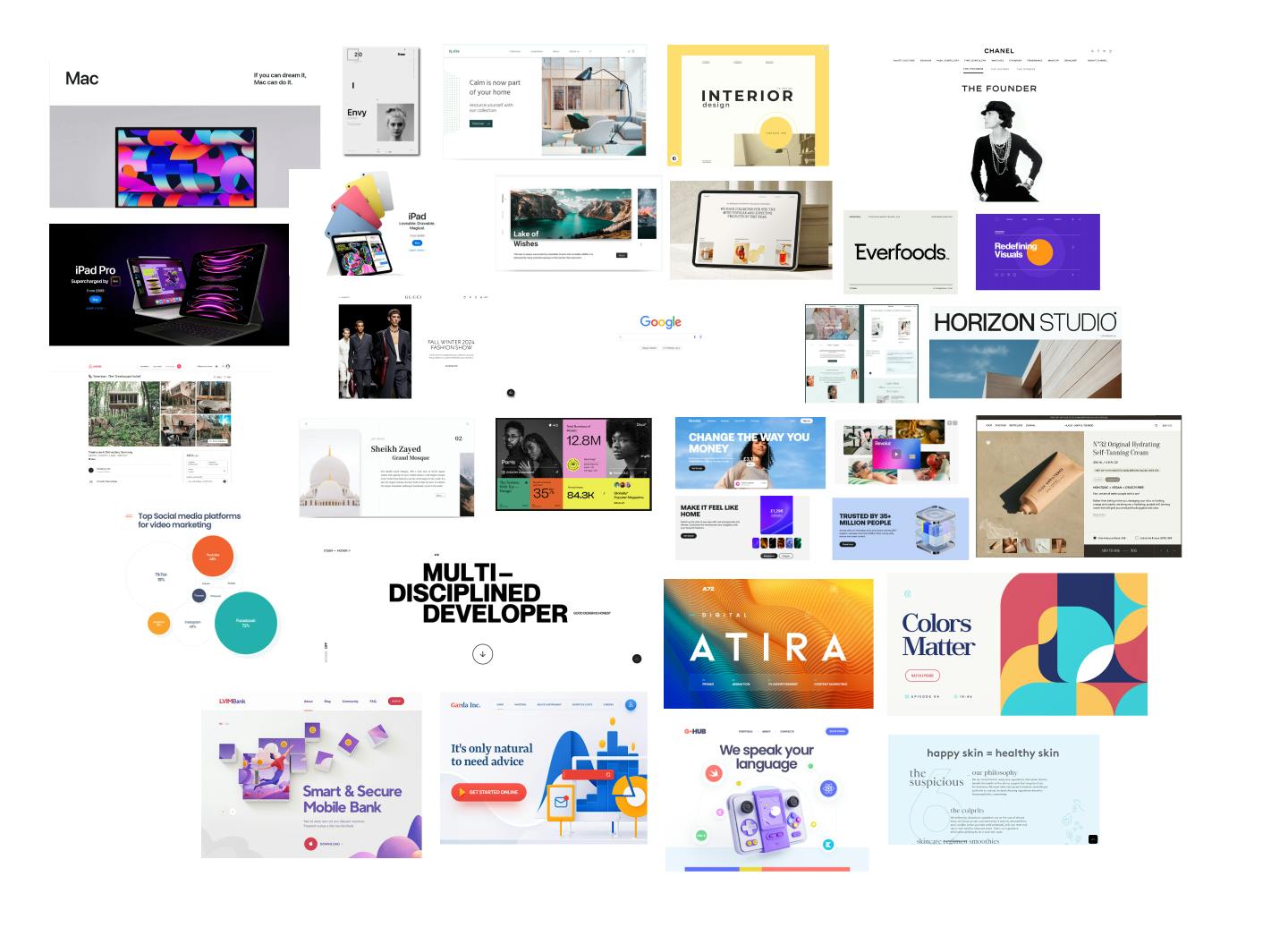
Clear moodboard
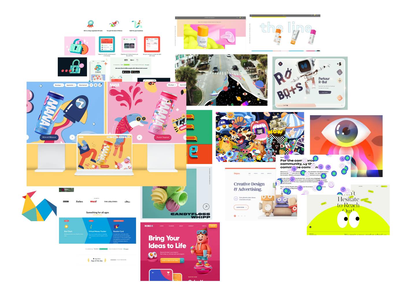
Fun mood board
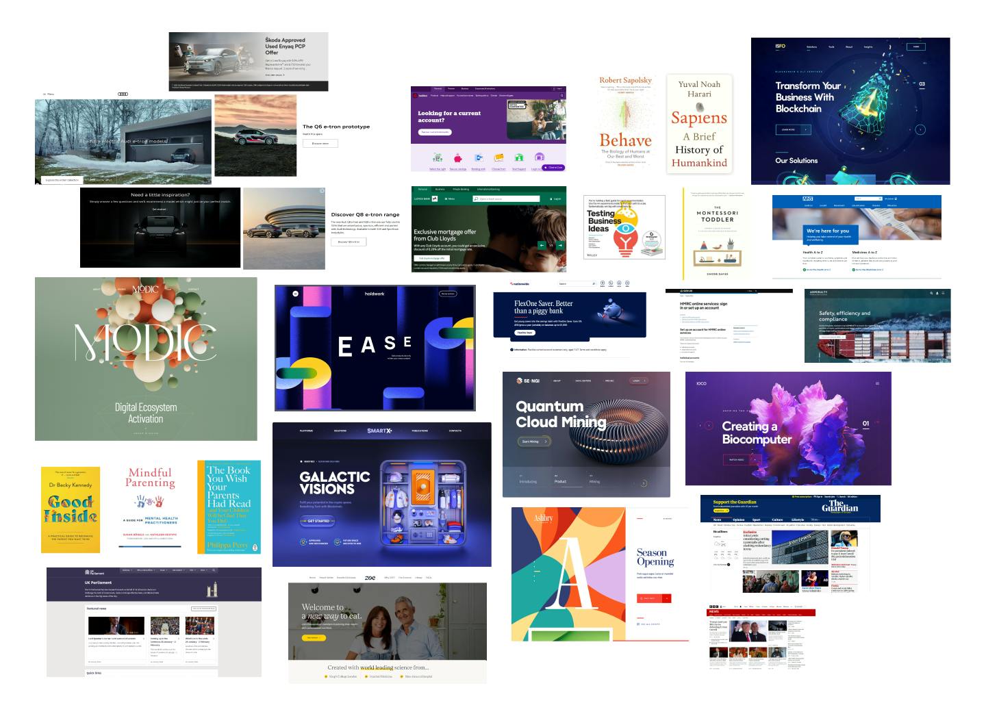
Trustworthy mood board
UX Design Institute UI Certification
I undertook training in UI design to enhance my skills, refine my skills in Figma, and deepen my understanding of designing for mobile platforms. The course covered multiple modules, exploring the UI design process in depth and all aspects of UI design. As part of the training, I was tasked with designing the UI for a challenger bank using a mobile-first approach.
I created three mood boards centred around the brand attributes of a challenger bank clarity, fun, and trustworthiness. Each board was thoughtfully curated and annotated to encapsulate these qualities, serving as a foundation to inspire and guide the design process.
Clear moodboard
Fun mood board
Trustworthy mood board
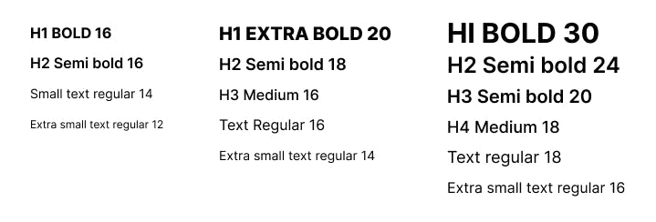
I discovered that by adjusting weights, case, letter spacing, and font size, I could achieve a versatile and cohesive design without needing to pair with another font. The typeface 'Inter' stood out for its clean and minimal aesthetic, delivering a sense of clarity and trust. When using bolder weights, it introduced a playful quality, making it a great fit for both branding and general text. I used shapes to create the logo but also to create a visual proximity of the different sections - tying them together. The shapes also emphasis the fun attribute of the brand
The final logo design and responsive typographic scales

I feel the colour palette captured the assignment well, using vibrant colours sparingly to compliment a deep ‘trusted’ shade of blue. The colour palette could also be considered a gender neutral palette making the branding approachable to a broader audience.
The final colour palette
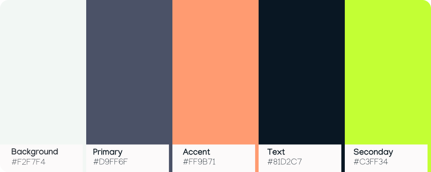
The iconography I’ve use is clean minimal and functional, I avoided anything too fussy and only used when necessary to avoid visual noise/clutter. I used an outlined approach as found this lighter on the eye.
The iconography set

Component design helped me refine my Figma skills, inspiring good design hygiene practises and reinforcing the importance of creating scalable, consistent, and well-documented components for efficient collaborative workflows.
The component library
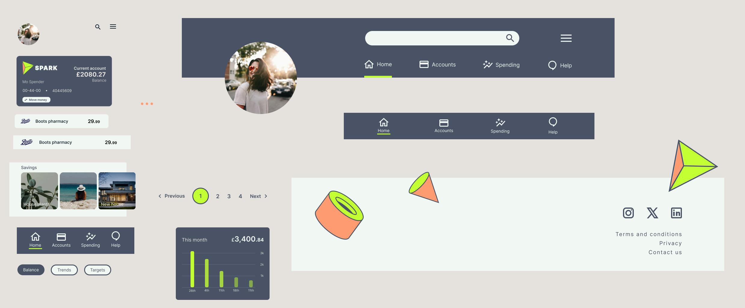
I found it interesting to play with responsiveness, the design developed as the space increased and allowed for more interesting features. I created different menus and headers for each state of responsivity.
In regards to hierarchy, I’ve used bolder headings sparingly to avoid cognitive and visual load. I allowed for a lot of white spacing enabling the eyes to rest and provide a clean minimal trusted modern look.
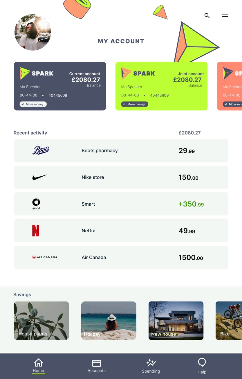
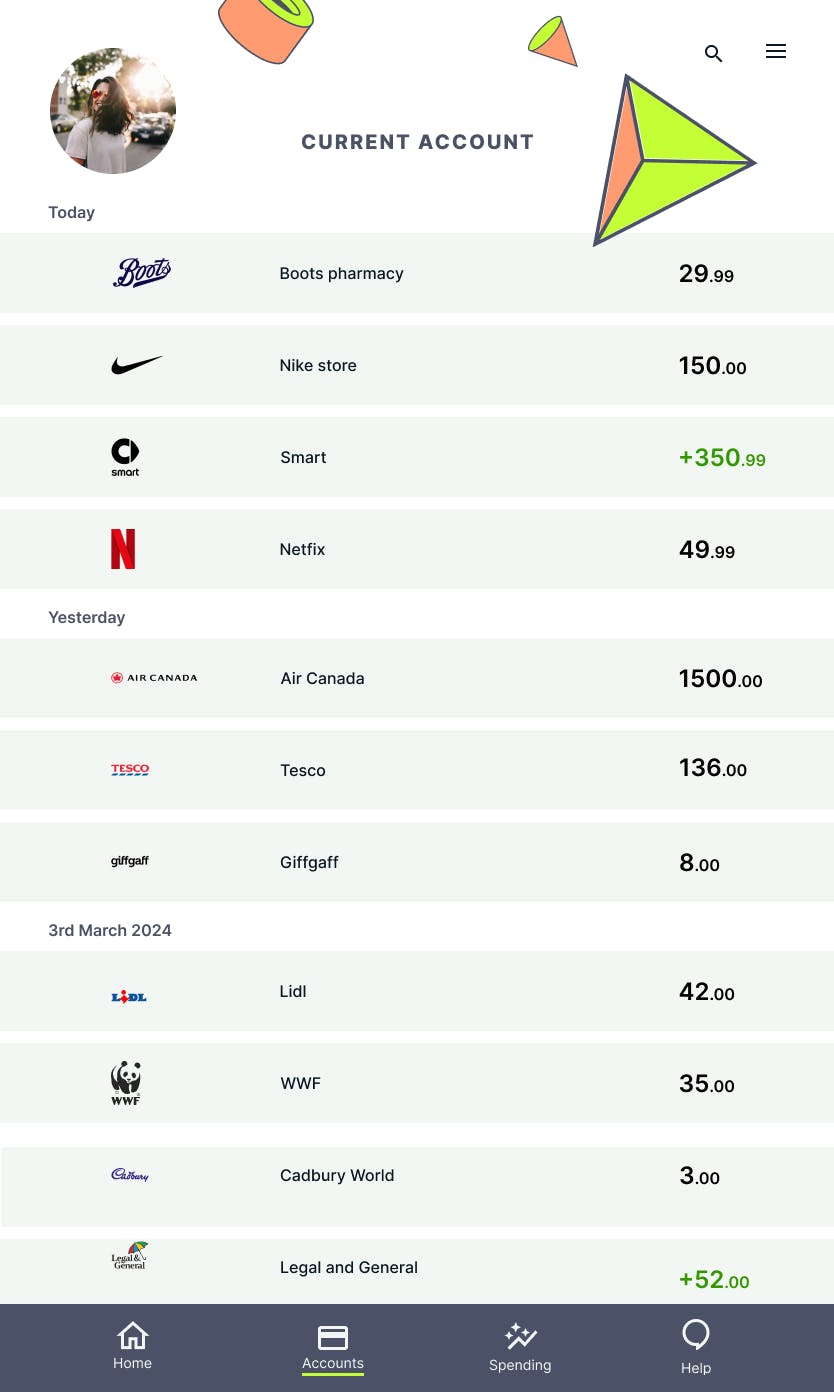
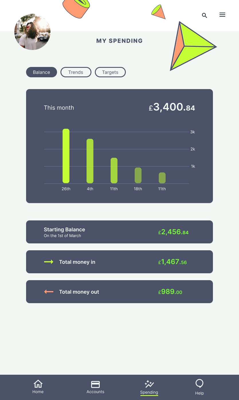
I’ve taken into account accessibility especially when using the the vibrant green colour - ensuring that it it always on a dark background for better contrast. I designed for desktop, tablet and mobile, below you can see examples of the tablet and mobile designs.
'My Accounts' for tablet
'Current Account' for tablet
'My Spending' for tablet
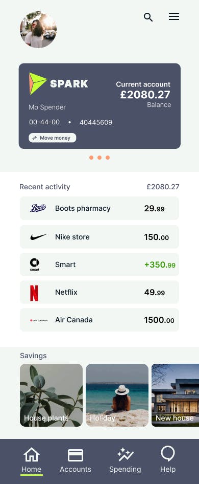
'My accounts' for mobile
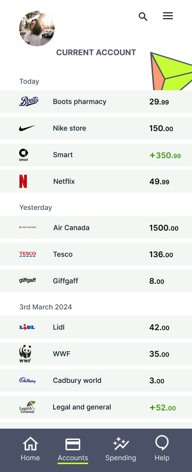
'Current Account' for mobile
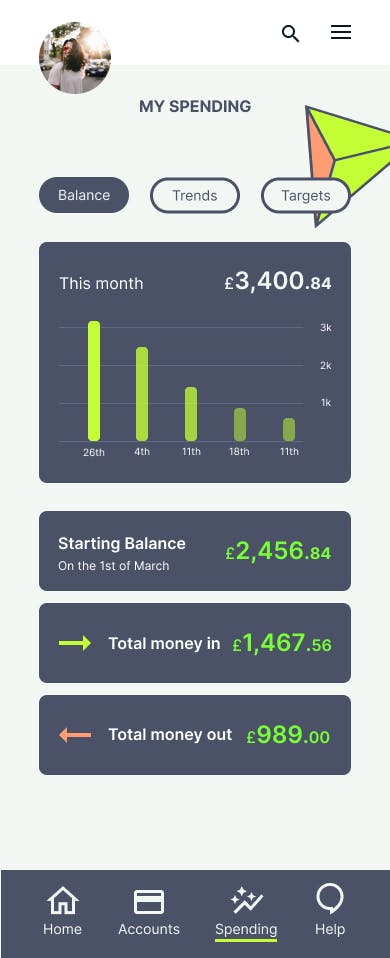
'My Spending' for mobile
I did this course alongside fulltime work, if I had more time, I would focus on improving consistency in font sizing, particularly for mobile accessibility, and refining typographic scaling across different screens. I’d also revisit my use of colour, exploring more powerful off-white tones, reducing reliance on white, and experimenting with gradients. Iconography felt limiting without a budget, so I’d aim to be more explorative in this area for future projects