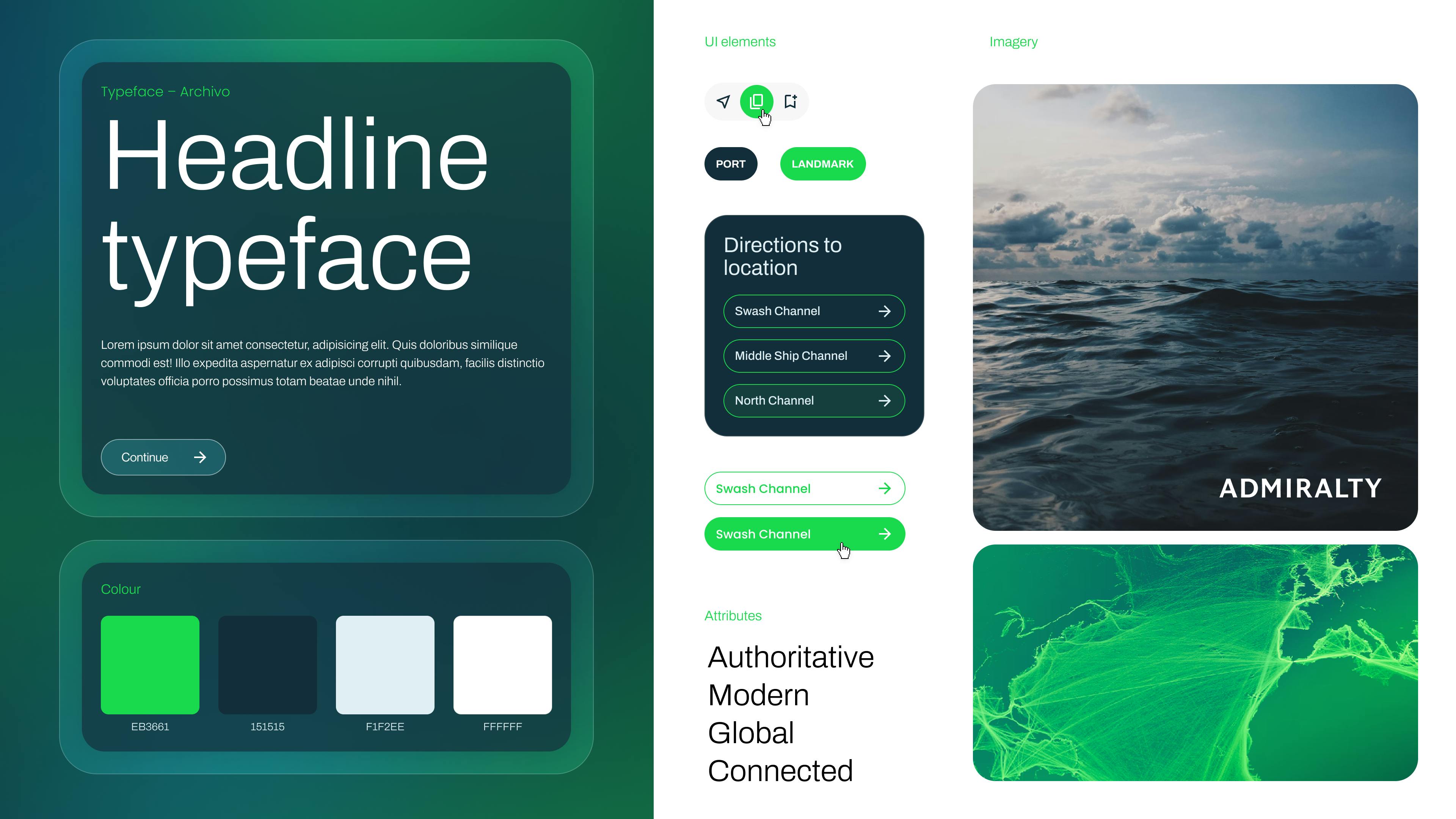
Image of style tile

The UKHO aims to establish itself as a dynamic, digitally-focused, thought leader with strong commercial appeal. However, the current ADMIRALTY Digital Sailing Directions (ADSD) digital interface is restricted by the existing design system and development capabilities, limiting its commercial viability and potential user engagement. ADSD was historically a paperback book used by mariners to plan voyages, striving to be digital first, UKHO are evolving the book into a digital product.
Original design
To address this, myself and another designer were tasked with exploring a refreshed, market-oriented brand approach in collaboration with design agency Great State, allowing us to enhance the interface's appeal, usability, and overall marketability.
This work resulted in a 'style tile' served as a guiding inspiration for our ongoing design efforts.
Image of style tile

The updated design aimed to be more modern and dynamic, while still giving an air of authority and trust.
We worked with Great State for several weeks. They helped us broaden our vision, develop two distinct options and refine these designs based on stakeholder feedback. From this feedback we took the best elements from each of the respective designs and tested this with users.
Commercial design
We discovered that:
Users had a preference for function over form: Many users struggled to notice the differences between the two designs, so gathering meaningful feedback was challenging. Design details weren’t something they were particularly interested in, requiring us to skilfully tease out unbiased insights.
Adjustable criticism of the commercial design: Feedback on the commercial design was much more constructive, highlighting specific areas for improvement that could be addressed through iterative updates.
The feedback was divided: Interestingly, feedback was divided, with many users expressing mixed feelings and noting their attraction to elements from both designs, particularly in terms of content presentation and the colour palette.
Current design misaligned with brand aspirations: Users who preferred the current design cited its familiarity, functionality, and traditional feel—qualities that may not fully align with the brand's desired image.
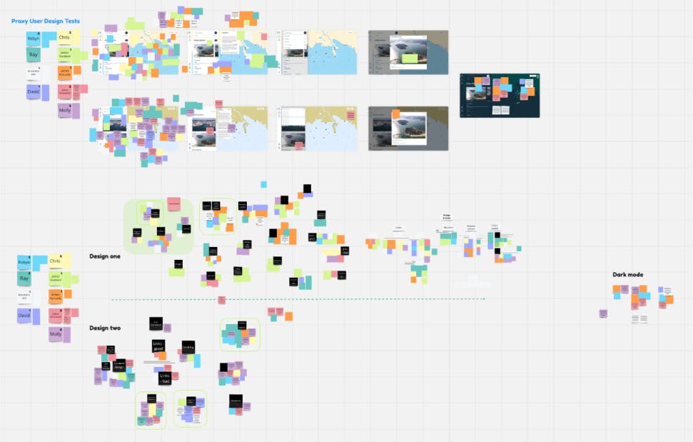
Image of research notes and affinity mapping

Further data analysis identified three opportunities:
1) Content presentation
We needed to explore re-structuring the content to prevent cognitive overload, in particular how the links were presented.
How might we improve the structure of the content?
2) Colour Palette
Users were very interested in the colour palette of the geo-display, this often informed which design they favoured.
How might we refine the geo-display's colour palette to align with user preferences?
3) Moderns vs traditional
There was an expectation that UKHO should be traditional and familiar, specialist, not too modern or commercial. With this in mind we needed to strike a balance.
How might we strike a balance between modern and traditional?
To improve the presentation of content we adjusted the header sizes, refined the link presentation through the grouping and proximity, we also highlighted areas of importance such as hazards.
Users found the colour palette (particularly in the Geo Display) in the commercial designs too bright, they spoke fondly of the colour palette used in paper charts, so we attempted to colour match this. To give more specialist, traditional feel and make the content feel more connected we removed the ‘glassy’ background and a few other superficial elements.
By testing these designs with users we have been able to go beyond the scope of work initially proposed. Refining these designs has not only enhanced commercial appeal but also improved useability making it easier for users navigate the text heavy content panel. The continued work we are doing alongside content design is creating a truly 'digital product' rather than a 'lift and shift' of the original copy.
Refined design